
Refreshing a room doesn’t have to be an expensive or complicated task. Adding a simple pop of color can transform a space, according to the pros. We asked designers to weigh in on TikTok’s “unexpected red” theory, which is among the trendiest and easiest ways to upgrade a space.
The trend was introduced by Brooklyn-based interior designer Taylor Migliazzo Simon. In a viral video, Simon defines the concept as "adding anything that’s red, big or small, to a room where it doesn’t match at all and it automatically looks better."
The beauty of this approach is that it can be adapted to any budget and design style. If you’re looking to keep things low-key, adding a bright red lamp or pair of throw pillows to an otherwise neutral room can do the trick. If you’re looking to go bolder, why not re-tile the fireplace with deep maroon tiles or hang an eye-catching piece of art with plenty of scarlet hues?
If you’re thinking there’s no way red details would work with your current color scheme, keep reading. Below, experts explain everything there is to know about the unexpected red theory, including tips on how to make it work in your space.

Why is the "unexpected red" theory going viral?
Red lipstick, flashy red sports cars, sky-high red-bottom stilettos — red is certainly an attention-grabbing favorite. But in a world dominated by neutral interiors, homeowners often gravitate towards safer options (unless it's a festive holiday occasion or their space is curated by a maximalist who embraces bold colors without hesitation).
But the past few years have shown us that more and more design enthusiasts are willing to welcome energetic color choices, like red, to normalize designing with your personality in mind. Yes, a red room can be jarring if not done correctly, but a splash of red doesn't hurt anyone!

Naïka Andre, interior designer and founder of NJA Interiors, agrees. "People are getting comfortable breaking design 'rules.' Red has always been considered a harsh color. People are seeing how designers successfully use this color in their spaces," she explains.
How to add some unexpected red to your home
Is pulling off the red color theory as easy as it looks? Not quite. The references Simon selected in the video featured complementary or analogous colors like blue-green and purple, so reddish undertones look right at home.
It's important to zero in on the red that works best for your room and ask yourself questions like, Should it be cool-toned or warm? How much of the color is going into use? and Where will it fit in best? This stimulating color is an instant wake-up call, but it can veer into a nightmare if there's no strategy.
Jamie Davis, co-founder of Portola Paints, advises that not all reds are created equal. "It is absolutely possible to create a shade of red that feels warm and inviting, but it can be tricky. Dialing back the saturation is a good place to start," says Davis.
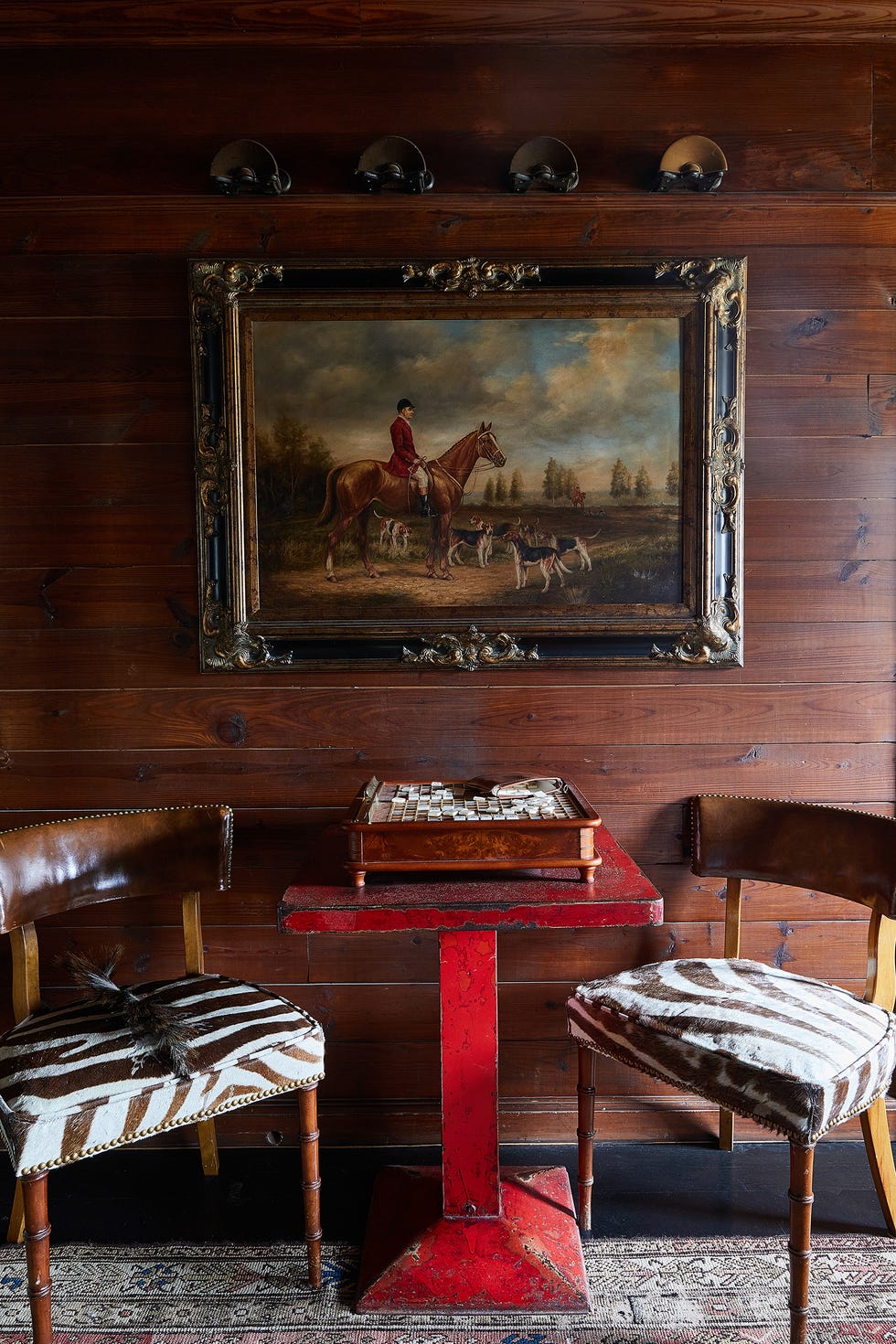
Before you begin buying jars of paint, notice that the examples Simon used focus on a pop of color, not a monochromatic look. The theory is making a major statement because it's a low-lift commitment that doesn't require hiring professionals. Red can be a playful, sexy and the extra zest of life your home is waiting for. Maybe it's time to break up a dull living room by adding contrast — go for a red accent chair! Or add a bouquet of red flowers to your coffee table.
Andre suggests starting small if you're intimidated by red. "Introduce a pop of red with flowers, an accent chair, artwork or a red picture frame. Observe how the color makes you feel. If you love it, go ahead and add more."

Do we think red is on its way to becoming a go-to neutral? Not quite. But is this invitation to take risks with colors more than welcome? Absolutely! "One misconception about the use of color in your home is that there are different rules associated with how you use color," Andre shares. "The beauty of designing your home is that you make up the rules. Incorporate colors that bring you joy."
Medgina Saint-Elien is a lifestyle and design editor, whose journey has been marked by her interest in popular culture and technology. Saint-Elien uses her editorial eye to find the "on the pulse" moments in media through trend forecasting, exciting new product launches, hands-on reviews, and covering the "lightbulb" moments in every maker's story. She is a creative strategist who conceptualizes digital franchises and partnerships that draw readers to take a second look. In addition to House Beautiful, her work has been published in Cosmopolitan, Byrdie, Snapchat, and more.


