
Wallpaper abounds in homes today, and people are increasingly intrigued by the idea of adding it to their own spaces. According to a new survey from Thumbtack—which cited “Printplosion” as a major trend—61% said they’d consider incorporating at least one type of pattern into their home over the next year.
Whether it’s an accent wall, striped entryway, or layered florals in the powder room, wallpaper is the perfect way to do that. But it begs the question: How do you make it look seamless?

How to Design a Room Around Your Wallpaper
Follow these designer tips to make sure your wallpaper feels cohesive with the rest of the space.
Pull Color from the Pattern
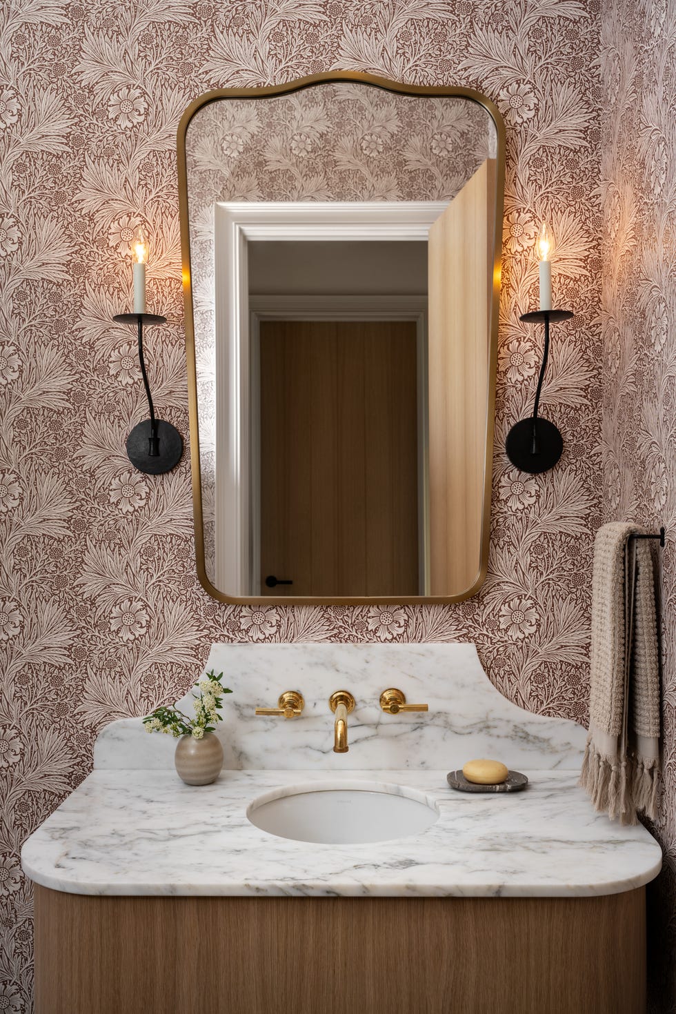
Pick one color from the wallpaper and repeat it in at least two other places in the room, advises interior designer Wendi Gee. This could be paint on the trim, walls, or ceiling, or through another piece of decor.
“It could be in a cushion, a rug, a lamp base, or a piece of art,” Gee says. “When a color from the wallpaper shows up elsewhere in the room, the whole thing starts to feel intentional.”
She adds that one repeat is not enough. Two or three makes the connection feel wholly designed.
Balance Bold Textures With Neutrals
If the wallpaper has a lot of movement or color, designer Joe Waroquier recommends introducing furniture and fabrics that give the eye a place to rest.
“A beautiful wood antique, a rich velvet, or a natural woven texture can complement a bold pattern without competing with it,” he says. Mixing materials, finishes, and even styles helps the room feel more collected versus static or flat, he adds.
Mind Your Undertones
Determine the dominant undertone of your wallpaper and let it guide the temperature of everything else. "Whatever that tone is, the paint, furniture, and textiles should follow it rather than fight it,” Gee says.
She adds, “If the wallpaper is warm and saturated, cool gray furniture will always feel slightly off. Warm-toned upholstery and natural wood will feel completely right.”

Layer Prints and Patterns
Bold wallpaper doesn't mean you have to play it safe everywhere else. “I love mixing patterns, as long as there's some variation in scale,” Waroquier says. “If the wallpaper has a large print, I might introduce a smaller stripe or a subtle patterned upholstery.”
He says that finding a common color between the patterns helps everything relate without feeling too coordinated. It instantly becomes layered, personal, and welcoming.

Wendy Rose Gould is a lifestyle journalist who routinely contributes to Real Simple, Martha Stewart, Women’s Health, and House Beautiful, among others. She covers home and garden, wellness, and travel, focusing on thoughtful storytelling and detailed reporting. When not writing, you can catch her perusing thrift stores, singing, hitting the gym, and petting any cat or dog that'll allow it.


